However, not many people are able to make the chosen color work for the brand. This, by the way, is one of the reasons why we strongly recommend hiring a graphic designer to create a company logo and other common design elements. First of all the company logo is the face of the company. It is something that your potential customers will pay attention to. The created logo will be further associated with your business, with your reputation, and even with your popularity.
People tend to evaluate at a glance, hang labels from the first impression. Make sure that your label evokes only those emotions and associations that you WANT to evoke from your target audience and beyond. Color used correctly is able to attract the necessary attention and lead a person to what is important. An incorrectly chosen color can confuse the viewer, cause frustration or even irritation.
Nevertheless, even if you consider the fact that a certain color can cause certain associations and try to stick to some color strategy, this may not be enough. In order to create an amazing logo and choose the right color for it, you need to conduct a number of marketing researches. For example, your graphic designer should clearly understand who your target audience is, what is it interested in, where it is going and what your own goals are.
In this article, we want to share basic information about logo colors, so you could implement all your knowledge on practice and create most amazing and attention driving logos for your brand.
Red Logo
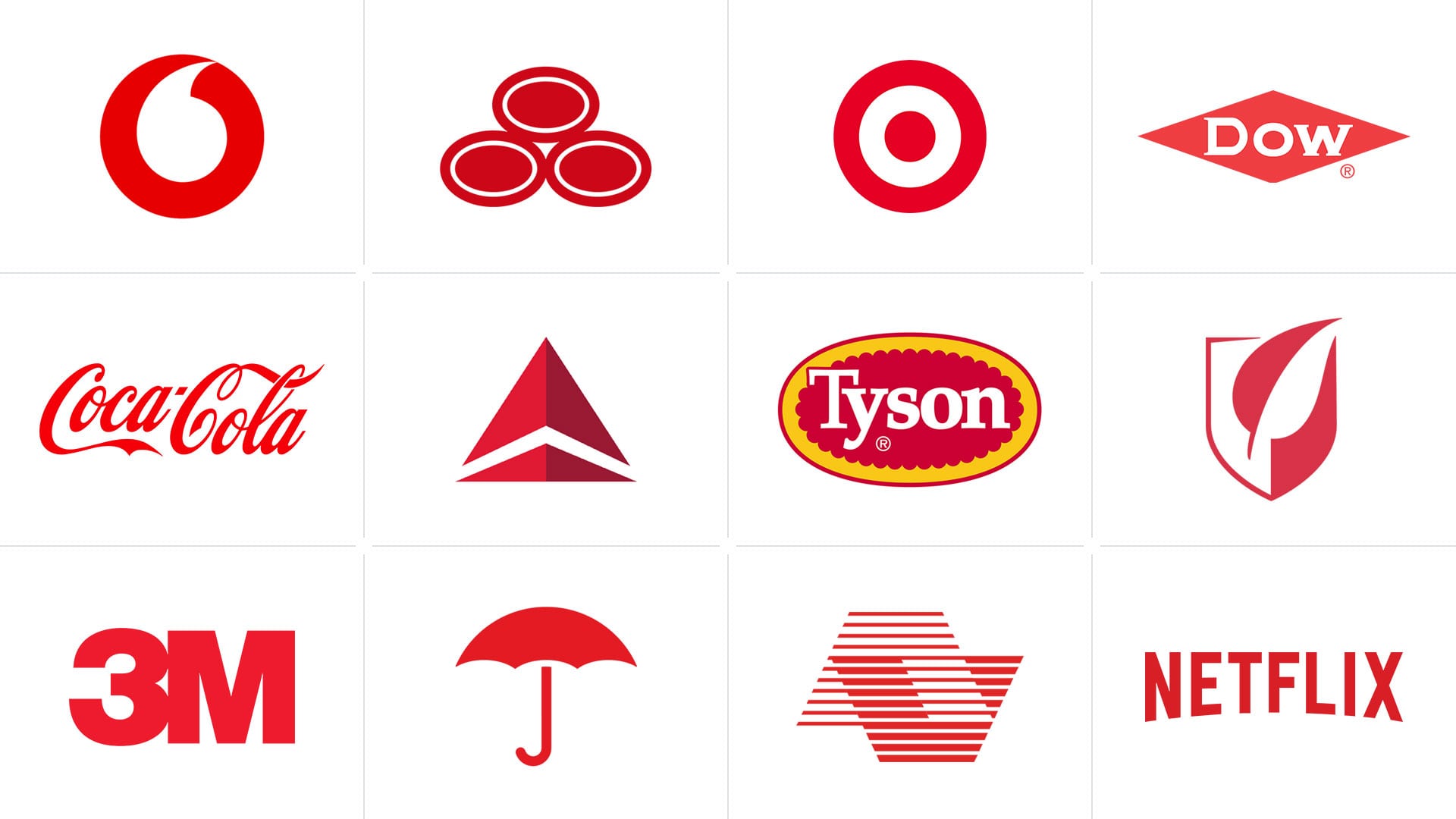
Red is one of the most meaningful colors that we know. It is strong and contradictory. We can use red in various spheres like legislative or restaurant. Red is very different. It says danger and stop, and at the same time, people associate it with passion, action, excitement. Red is the color of red lipstick, red roses, and yet it is the color of the bullfighter cloak or blood pulsating in the veins. Everything that is associated with red, causes a surge of emotions and a storm of passion, a sense of power and energy. If you look at companies that have chosen a red logo for their brand – these are powerful and vibrant brands that are successfully moving towards their goals. The red color messages a strong flow of energy.
Moreover, when people look at red color, it can increase their pulse and cause appetite.
Orange Logo
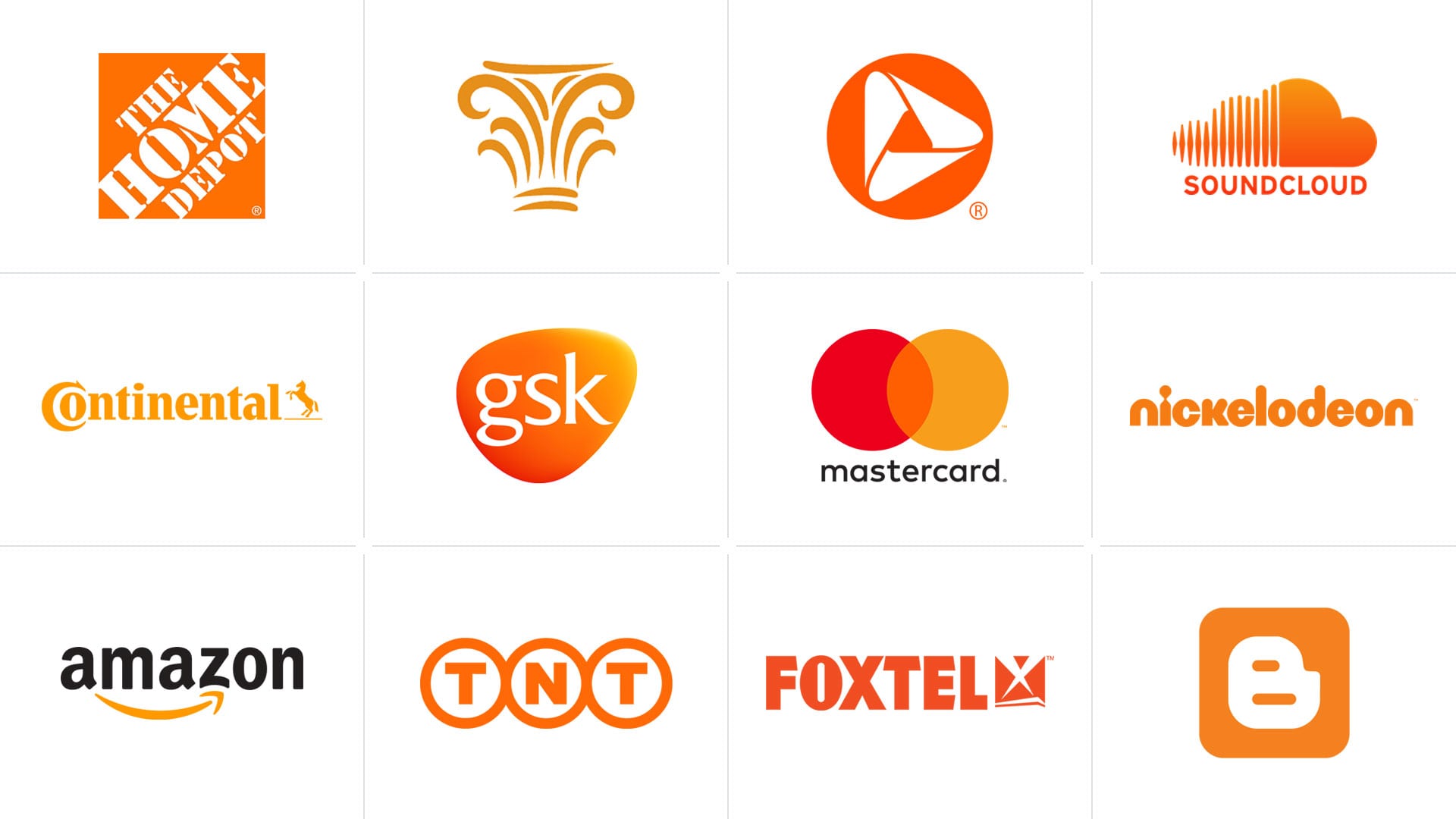
Orange color symbolizes sun, warmth, bliss and health. No wonder this color is synonymous to a fruit, which contains a daily dose of vitamins. Orange is associated with activity and vitality. In psychotherapy, this color is used to set a positive attitude. People who choose orange have tremendous patience, are sympathetic and always in a good mood. Orange color is able to stimulate brain activity, cause a pleasant excitement and at the same time it is not irritating. Brands use orange logos when they want to create a sense of fun, prosperity and intellectual power.
Yellow Logo
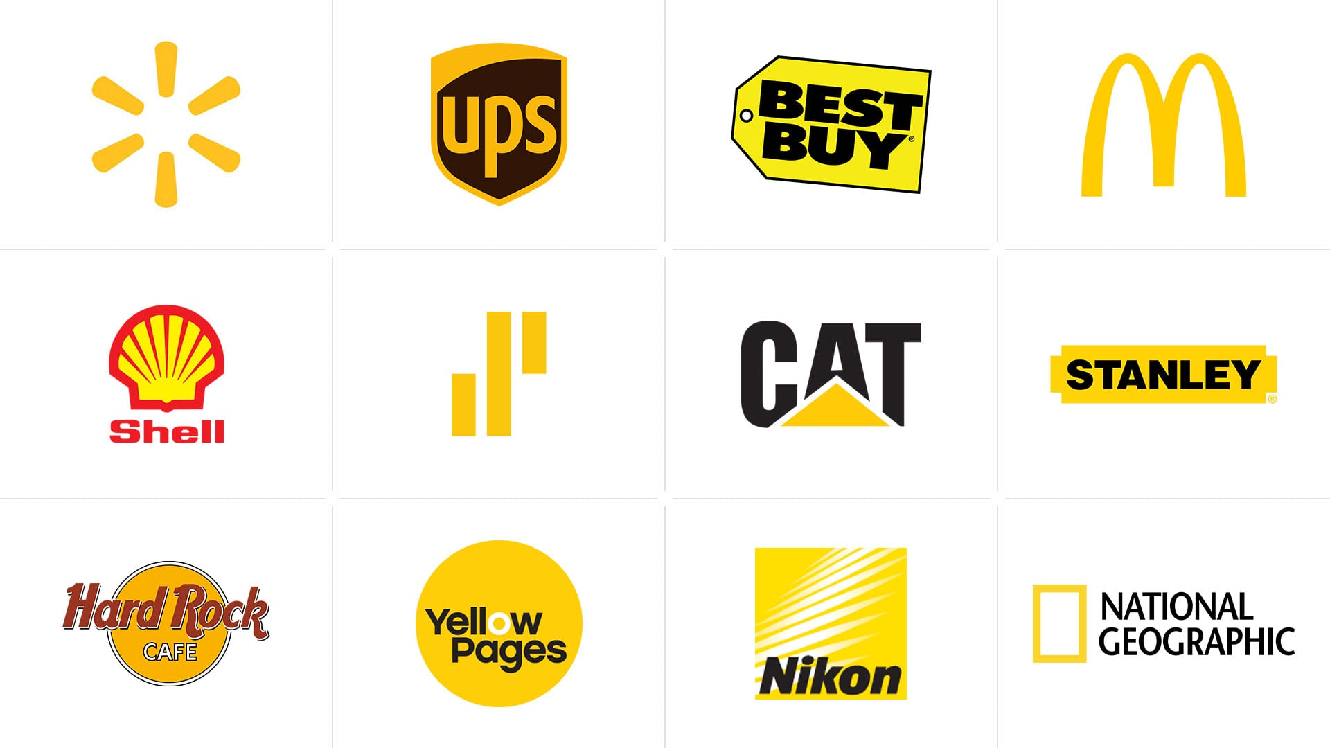
Yellow color refers to a feeling of joy, warmth and optimism. It is associated with bright and positive moments of life, and at the same time it is the color of logic and forward-thinking. The plants with yellow inflorescences are widely used in various diseases treatment. Marketers also prefer to deal with this color, as it is able to stand out even among a variety of bright colors, and helps to memorize information. People who choose yellow are ingenious and self-confident. However, we must note that you have to use yellow color skillfully. Overabundance of yellow can cause overexcitation and anxiety.
Yellow logos are chosen by brands that want to announce the formation of an independent unit in the market, strong, successful, but friendly at the same time.
Green Logo
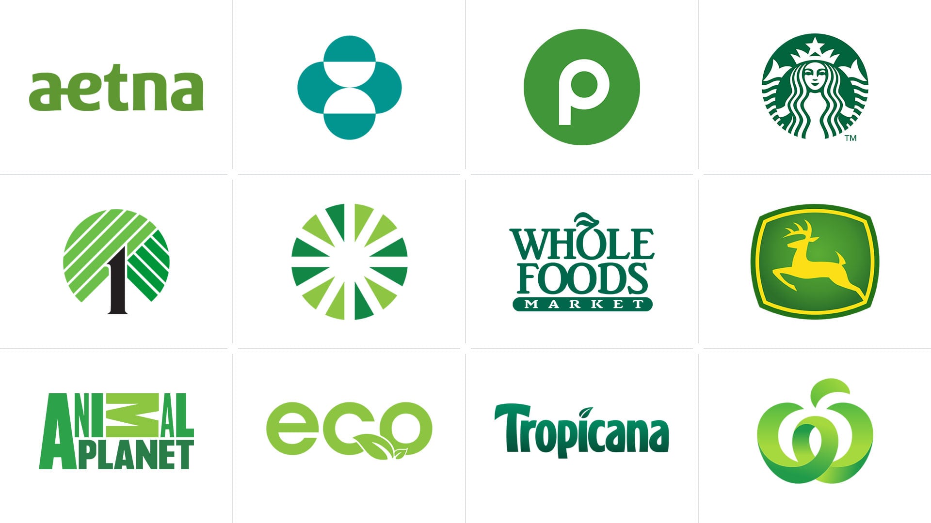
Green color often associates with nature, greenery, vegetables. It symbolizes youth, hope, fertility and prosperity. For the majority of people green means harmony. Companies that choose green for their logo want to evoke a sense of reliability and generosity in their customers. The green logo says, “Be calm, everything is fine. You are healthy, successful and rich.”
Blue Logo
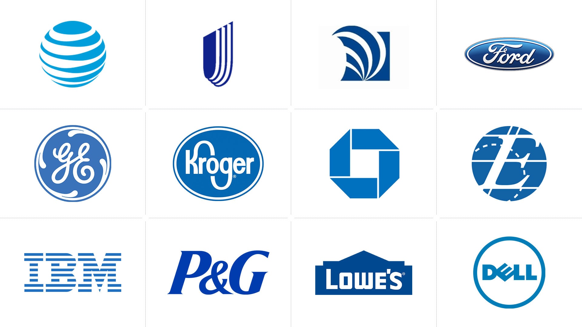
By nature, blue color is very rich, deep and mysterious. We associate it with the sky, water, space. These are eternal and immense concepts that have neither materialistic value nor they can be counted. They are permanent. Companies that use blue in their design want to evoke trust and security associations from customers. They are reserved, intelligent, patient and independent. With the right approach, the blue logo will rise a sense of calm, security and confidence.
Pink Logo
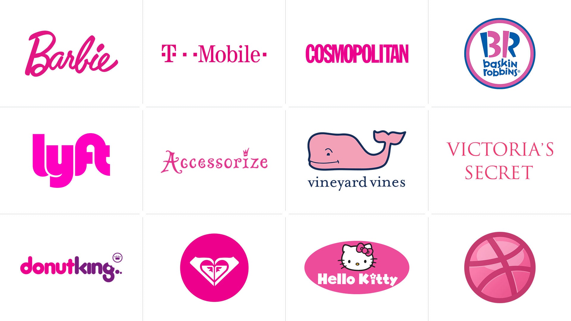
Despite the fact that there are many male fans of pink color in the world, yet we tend to believe that pink is the color of femininity. It is used to attract interest of both the adult audience and the young girls. Pink color causes a feeling of tenderness and playfulness. It is one of the softest and most neutral colors among all. It symbolizes love, lightness and kindness, purity and innocence.
Purple Logo
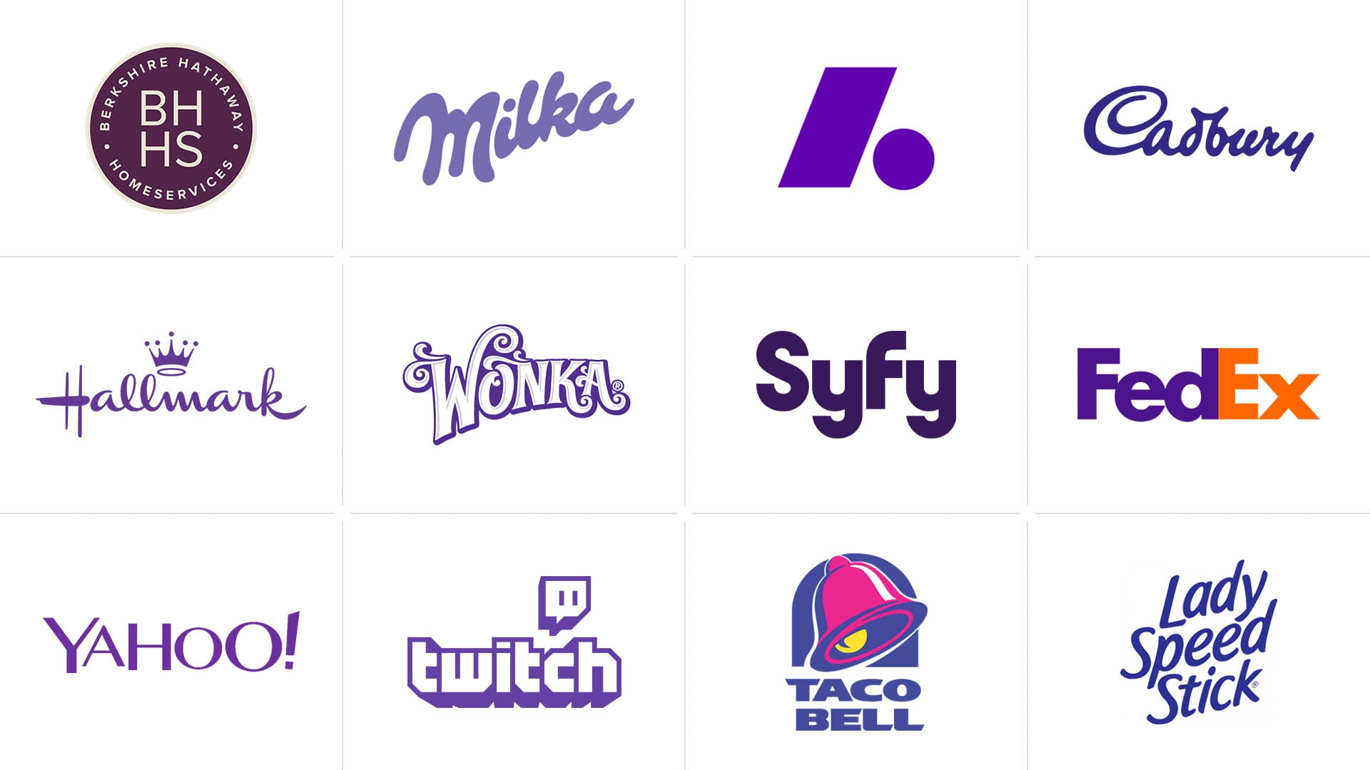
Purple is a symbol of maturity and wisdom. In some cultures, it is also associated with noble society, royalty and other aristocratic concepts. This rich color allures wealth, unshakable power. Its greatness promotes inspiration. Fans of purple also attribute to its sensuality. Probably this is the reason why many brands engaged in the fashion and beauty industry often use this color in their logos design.
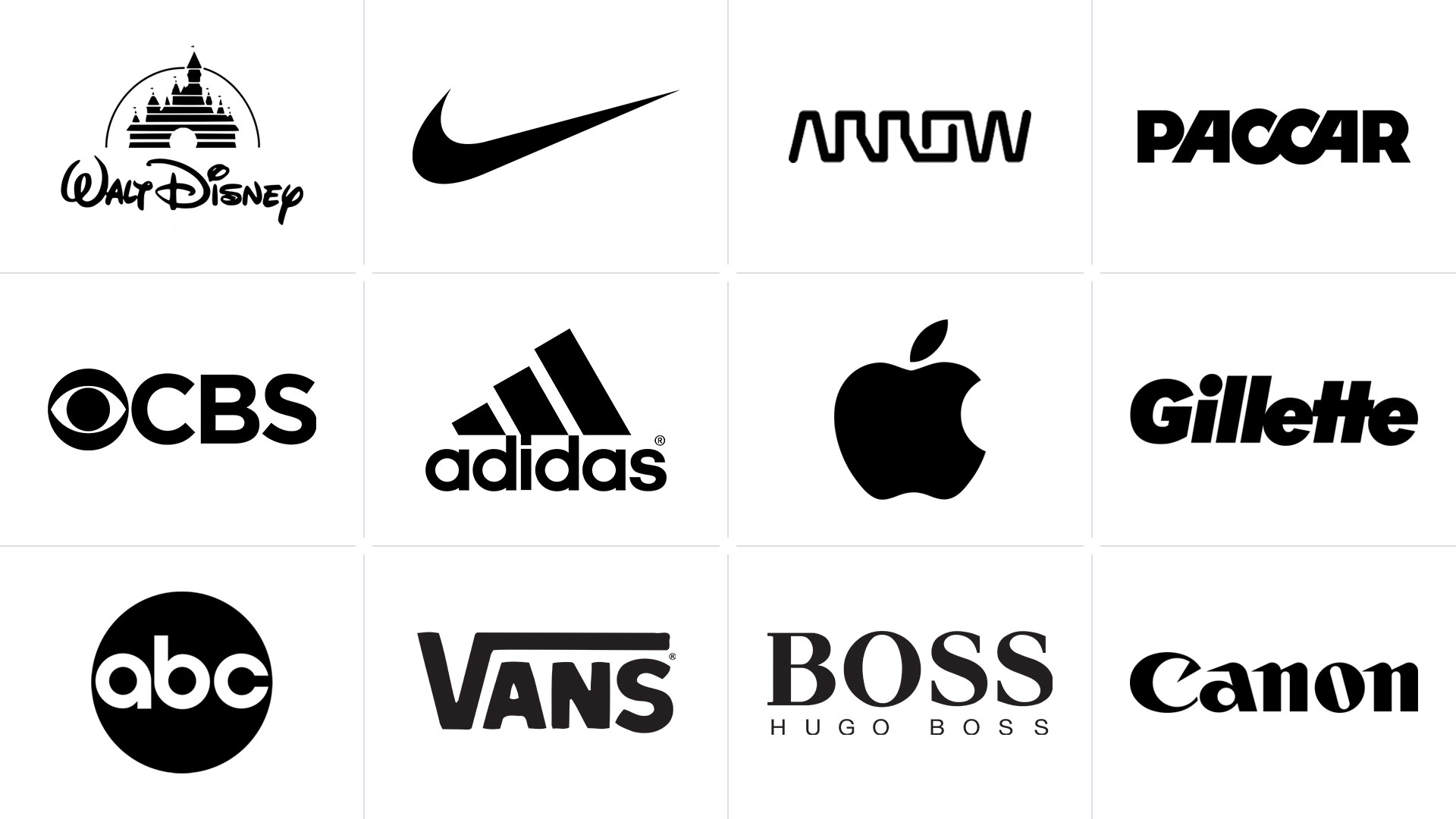
Black Logo
Black color is exquisite and mysterious. It is calm, does not shout about its presence, but at the same time confident, elegant and expensive. Moreover, we can combine black color with almost any other color and shade. It gives a huge field for experiments, while remaining a classic.
Black color is used by brands that do not seek for attention. They have already overcome their competitors. These brands want to show their buyer that they are serious about their intentions.